MEDICINE MAMA
BRAND DESIGN SS/21
Designed to emulate healing, creativity, and vibrational energy, this concept is the ultimate feel-good brand.
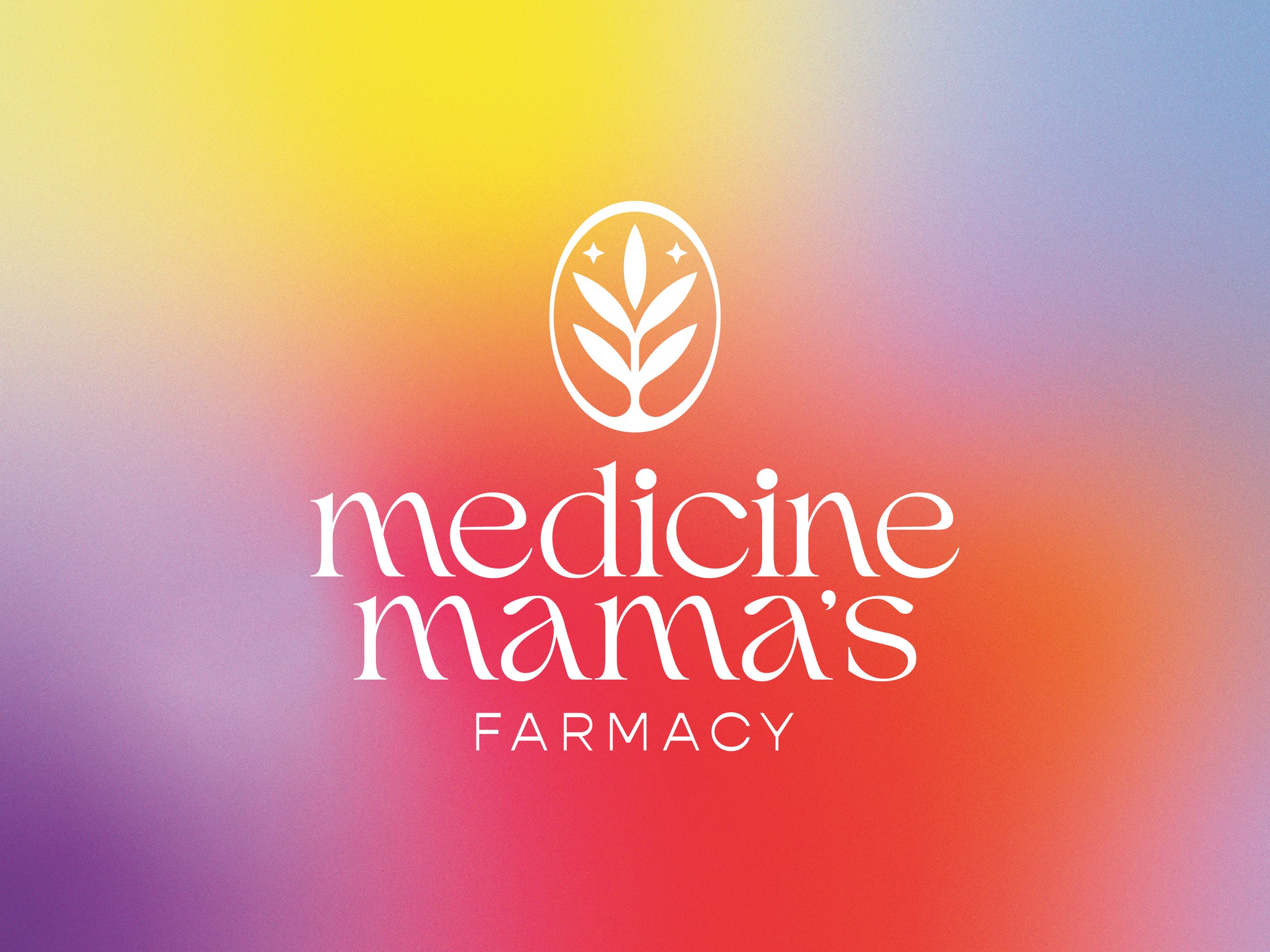
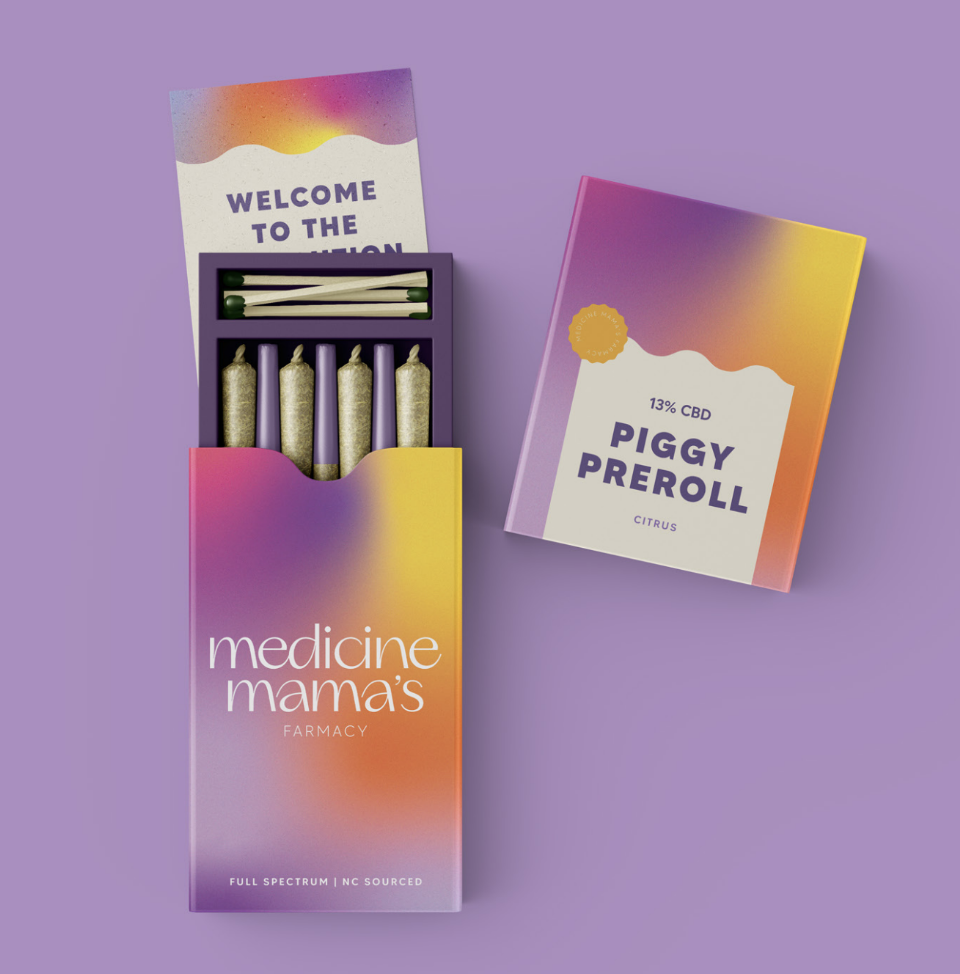
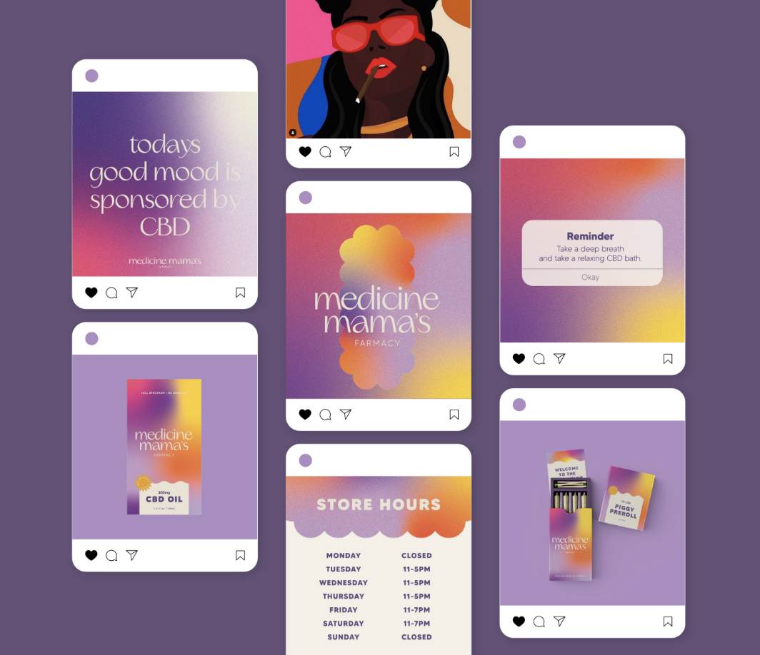
The word mark has been kept simple with the use of a decorative font that has been customized to create a sense of fluidity. The logo mark compliments the aura-like gradient patterns that have been custom-created to set your store apart from the rest. The purple hues have been prioritized within the brand palette to keep true to Medicine Mama’s history and embody a sense of the owner's personality within the brand. The cloud asset has been designed as an ode to the medicinal power of CBD and the feeling of stepping into a new world without pain. This shape can also be incorporated as a product identifier or as a motion graphic for digital use.
Overall this brand is sophisticated yet fun and energetic. The delicate balance of clean typography with a bright and bold colour palette allows this brand to stand out professionally and appeal to many different demographics.


