VALLEY ALCHEMIST
PACKAGING W/21
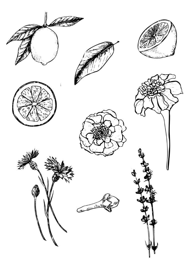
For this concept, we went with a more feminine vibe with vintage floral illustrations, and light pastel colours. The packaging has been kept to white to allow for the floral designs and colours to pop. The typography is more traditional with a serif font which add class and sophistication to the packaging. Each tea type will have a set of botanical ingredients illustrated on them, set in different pastel tones. This will allow for the consumer to easily separate different tea blends.


